GEN Magazine
Editorial, Publication Strategy2019
GEN is a publication for stories documenting the powerful forces reshaping our world.
The best ideas can change who we are. Medium is where those ideas take shape, take off, and spark powerful conversations. The start of Medium’s O&O publications marked Medium’s evolution as both platform and publisher.
GEN was launched in 2019 with goal of helping readers understand the powerful forces reshaping our world through politics. As one of Medium’s first in-house editorial verticals, GEN’s visual identity and brand voice was crafted to be an extention of its editorial voice.
GEN was launched in 2019 with goal of helping readers understand the powerful forces reshaping our world through politics. As one of Medium’s first in-house editorial verticals, GEN’s visual identity and brand voice was crafted to be an extention of its editorial voice.
Design Direction
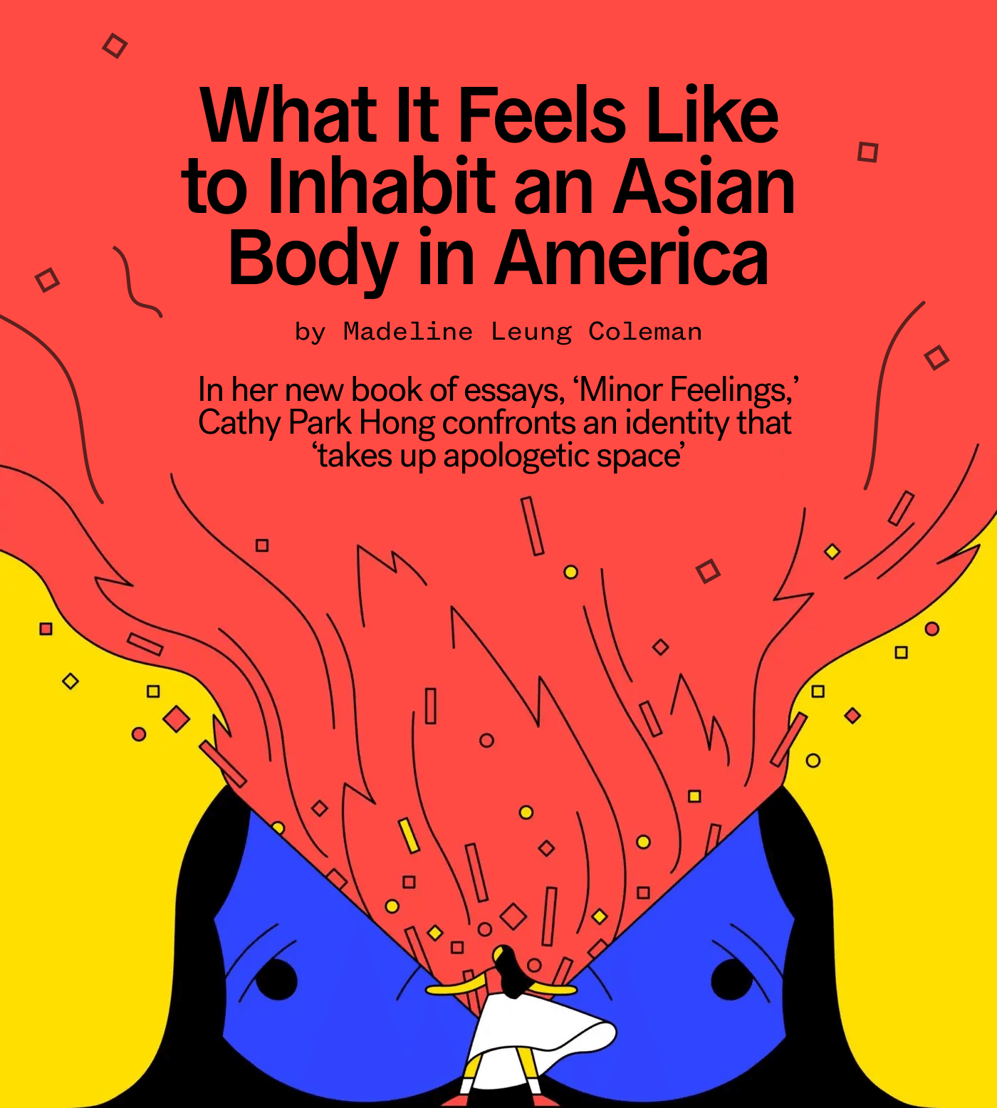
The GEN’s brand system was inspired by the themes of power, culture, and commentary. General Grotesque and Sohne were selected as the primary type pairings.
General Grotesque reclined was selected as a primary typeface--Its sans-serif, left-leaning italics “backslant” weight, signifes the left-wing politicical idealogy that supports social equality and egalitarianism. The font family was designed by Stéphane Elbaz of General Type Studio. The leterforms features moderately high waisted crossbars.
Söhne, as a secondary typeface, felt noble, humble, authentic, and optimomistic. The halbfett weight was chosen for its gravity and bolder letterforms. Söhne was designed by Kris Sowerby of Klim Type Foundry.


Visual Direction
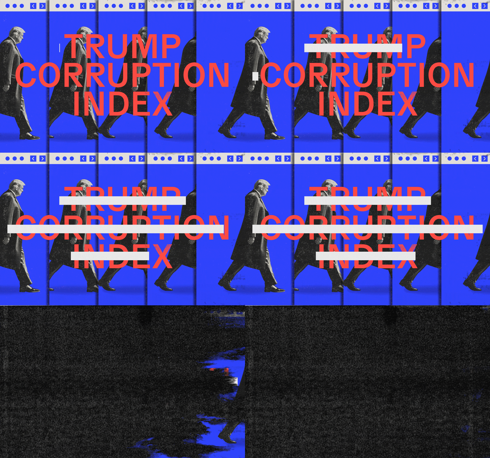
GEN’s visual direction strives to reconsile the relationship between arts and politics. The image making practice of collage inspired the art direction strategy. As a powerful tool of social commentary, the method of collage is inseparable from its historical and political context.
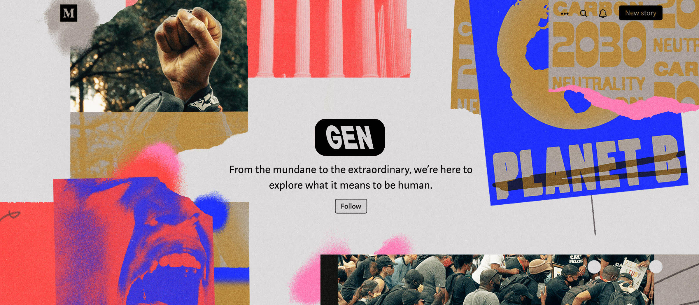
The visual language of GEN incorprated found images, textures, halftone, maps, noise, and ripped paper. Images felt distinct and uniquely branded to GEN both on and off platform.
The visual language of GEN incorprated found images, textures, halftone, maps, noise, and ripped paper. Images felt distinct and uniquely branded to GEN both on and off platform.
Credits
Produced at Medium.
Project: GEN Magazine
Client: Medium
Launch: 2019
Audience Reach: 97K
EIC: Brendan Vaughan
Design Manager: Ryan Hubbard
Photography Direction: Xenia Rollinson
Art Direction: Jovanna Tosello, Claire Merchlinsky, Jon Han, Tessa Modi
Designer: Noah Baker
