
DoorDash - Local Flavor, Manhattan
Advertorial, Native Advertising
2021
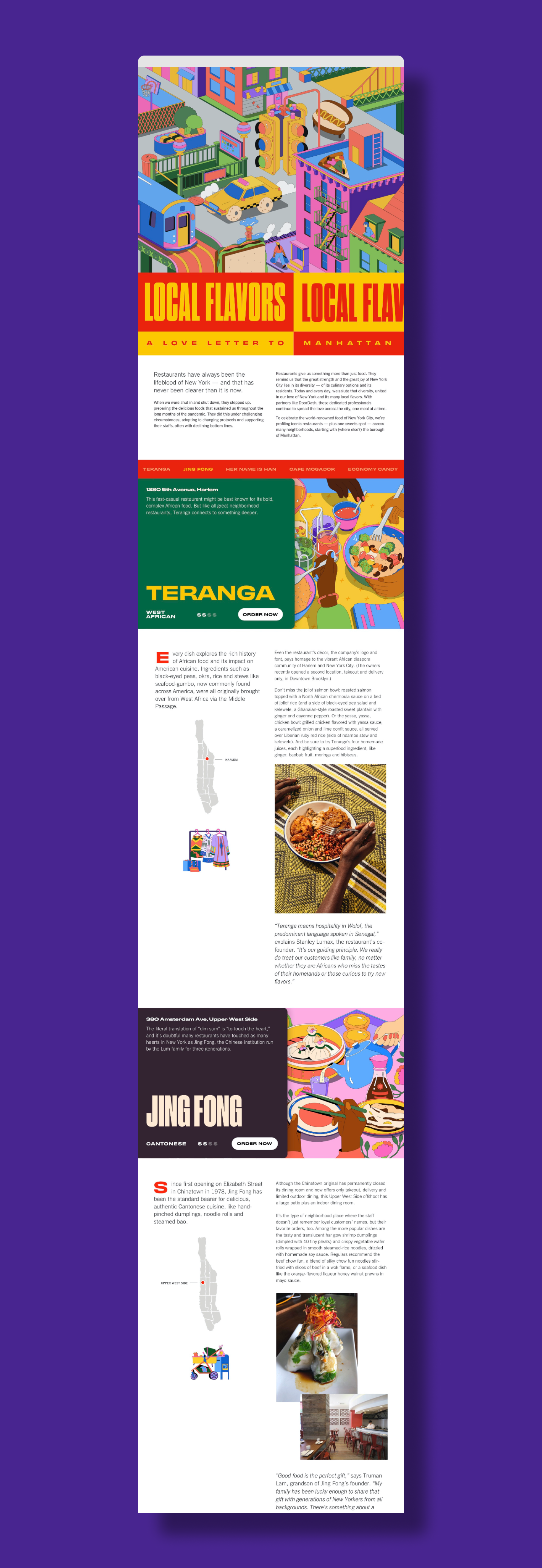
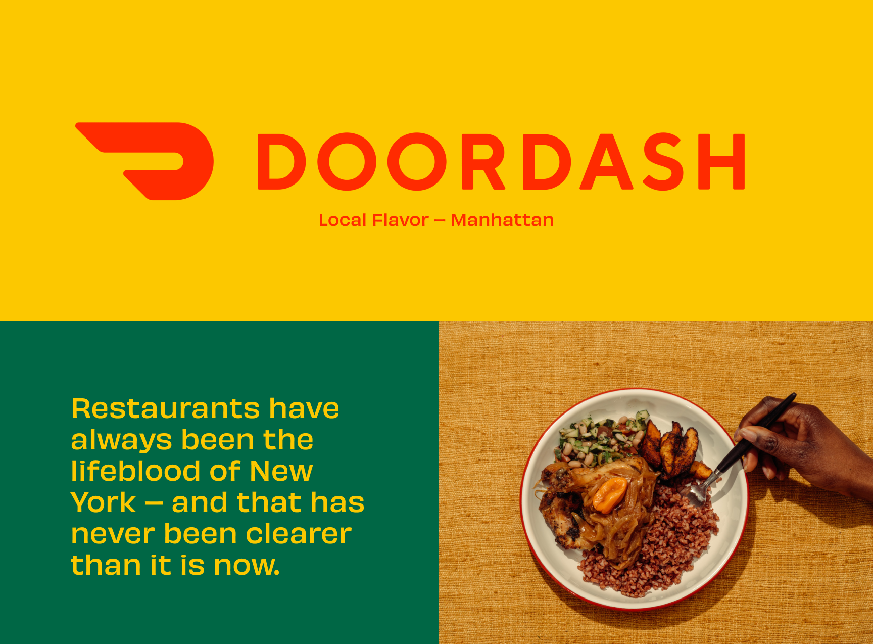
Restaurants have always been the lifeblood of New York — and that has never been clearer than it is now.
To celebrate the world-renowned food of New York City, DoorDash and T Brand profiled iconic restaurants — plus one spot for sweets — across many neighborhoods, starting with the borough of Manhattan.
Local Flavor Manhattan was a native advertising campaign with the goal of positioning DoorDash as the go-to food delivery service in New York City. The brief was to create a virtual tour of five restaurants on the island of Manhattan, focusing specifically on the unique neighborhood in which they inhabit. Local New Yorkers could reconnect with some of their favorite Manhattan neighborhoods, while also discovering new establishments from afar.
Local Flavor Manhattan was a native advertising campaign with the goal of positioning DoorDash as the go-to food delivery service in New York City. The brief was to create a virtual tour of five restaurants on the island of Manhattan, focusing specifically on the unique neighborhood in which they inhabit. Local New Yorkers could reconnect with some of their favorite Manhattan neighborhoods, while also discovering new establishments from afar.
Visual Direction
As art director of the program, I was responsible for the development of visual direction and leading the design team through completion of the program - this involved collaborating directly with the editorial team to craft a visual narrative in line with the goals of the editorial, as well as leading the creative production of the bespoke page development.
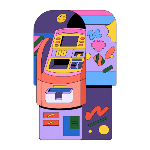
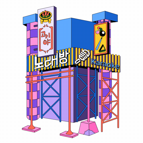
All the components of the visual direction - illustration, color, type, graphic design, etc, have a unique ability to elicit an emotional response in a reader. The art direction was crafted to evoke specific tonal qualities and inform all facets of the visual presentation. In order to create the desired resonance, we articulated a visual strategy that felt in line with the client’s objectives: adventurous, fun, optimistic, and delightful.
All the components of the visual direction - illustration, color, type, graphic design, etc, have a unique ability to elicit an emotional response in a reader. The art direction was crafted to evoke specific tonal qualities and inform all facets of the visual presentation. In order to create the desired resonance, we articulated a visual strategy that felt in line with the client’s objectives: adventurous, fun, optimistic, and delightful.
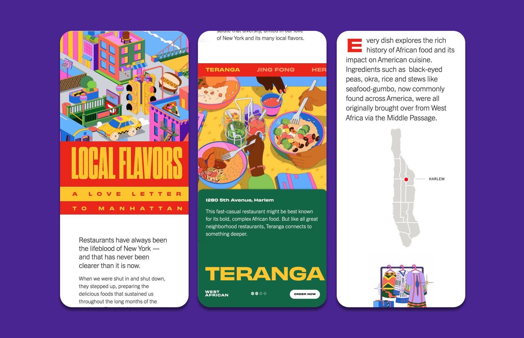
Core to this concept was the idea that New York City has a special emotional connection with its inhabitants - from distinctive neighborhoods to architectural icons. We wanted to play to the relationship all New Yorkers share through a sense of “place”.
From the tenement buildings of the Lower East Side all the way to how the expansion of the rapid transit system influenced the anatomy of the city, New York plays an important role in our everyday lives, and experiences - we wanted to highlight these unique characteristics in the opening image to introduce the program.
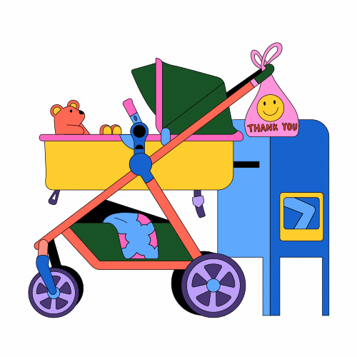
In order to achieve the tonal direction of the program, we specified a stylistic profile that evoked feelings of adventure, delight, fun, and surprise. We chose Jiaqi Wang to illustrate the program because her work felt colorful, clean, and stylized yet approachable.


Design Direction
The design direction for this program created an immersive, interactive reader experience to represent the vibrant and energetic aspects of New York City. Nicholas, our senior designer, was game to experiment with opportunities to suprise and delight the audience.
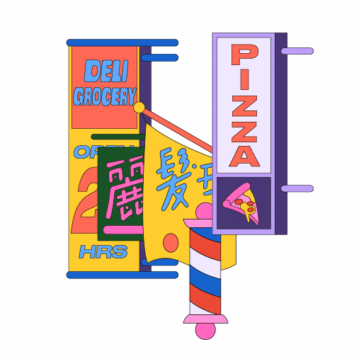
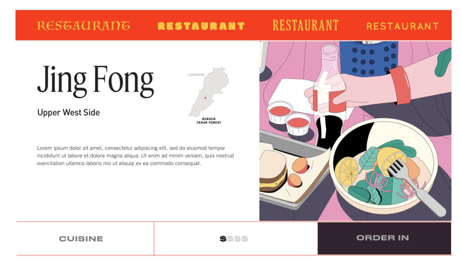
The early inspiration of the page layout hierarchy came from menus. Traditionally, a menu is contructed to be informational, yet visually communicate the characteristics of the brand voice of that particular restaurant.
With many unique and iconic motifs which are easily recognizable in this arena it seemed like a direction which would turn into something diverse and visually interesting. Each restaurant would have an opener which resembled a menu which could provide an historical summary and other categorical info.
Color and font were strategically selected in order to complement and play off of the visual cues of the illustrator Jiaqi Wang. Her illustration utilized a vibrant and saturated palette that felt bright and bold, yet balanced against the synergistic type pairings.


Interactivity and Responsive Design
Interactivity and responsive design were vitally important to the theme of this program. Readers were invited to interact with the page through a series of scroll-based triggers, creating an experience of surprise and delight.
The reader is met with an immersive animated image of New York City. As the reader scrolls down the page, a section header animates on to reveal the name of the restaurant, a brief introductory history, the cuisine type, and a invitational call to action to “Order Now”. Interactions that activate on the reader’s scroll in real time incentivize the reader to discover down the page and increase scroll depth metrics.
The reader is met with an immersive animated image of New York City. As the reader scrolls down the page, a section header animates on to reveal the name of the restaurant, a brief introductory history, the cuisine type, and a invitational call to action to “Order Now”. Interactions that activate on the reader’s scroll in real time incentivize the reader to discover down the page and increase scroll depth metrics.
Our design team included lead developer Eva Peng and senior designer Nicholas Garber who devised a strategy to create interactive elements which are triggered by interactions that felt native to the digital reading experience.


Credits
Produced at T Brand Studio
Client: DoorDash
Project: Local Flavors - Manhattan
Launch: 2021
Senior Program Manager: Joshua Eisenman
Strategist: Brittany Kirwan
Editor: Daniel Simmons
Art Direction: Jovanna Tosello, Nicholas Garber
Senior Designer: Nicholas Garber
Lead Developer, Engineer: Eva Peng
Illustrator: Jiaqi Wang